 alt Hacker News
AI-generated posters don’t have to be horrible
Comments
We just have to accept that we’re now living in the age of industrialization of any skill that is digitized. And on average that means it’s not better than what a qualified professional can produce, but it’s good enough, and good value for money. Just like IKEA furniture is not better than anything that a skilled carpenter can create, but most of us settle on industrialized furniture because we don’t have the budget for better, or we prefer to spend it elsewhere. Similarly, most companies don’t need bespoke posters nor software.
Small businesses torching years and years of propaganda and goodwill lavished on them, so they can save the $50 it would cost to have a human design a decent-looking poster.
"Me: a poster paint drawing by his young child."
Some time ago, I was in this apartment complex and there was a hand drawn sign of a dog pooping on the grass - the sign then said that residents should pick up after their dog. It looked like the locals living in the apartment complex had their child draw the dog pooping in a slightly adorable style. I remember feeling kind of happy about this, like I could see a kid sitting there with some crayons painting this dog. I know there were human artists perfecting this child like style before but still feels like some humanity is getting lost here making AI paint like a kid.
What I find off-putting is the emoji style used. They look like images you'd find in a first grade workbook, or on sticker sheets handed out to first graders. I quit using emojis on my phone because of that "playmobil" look.
I suspect this trend started with the yellow happy face. Barf.
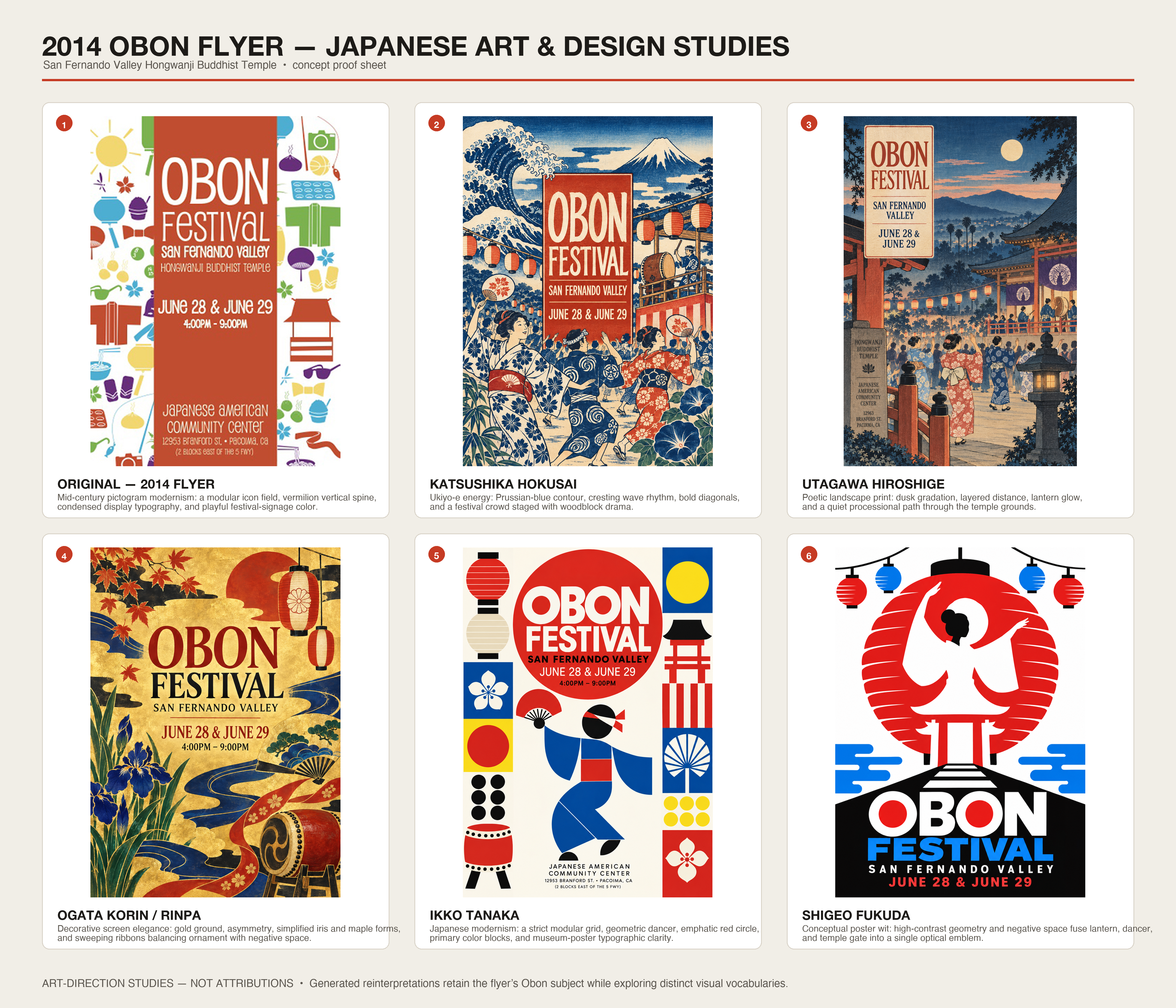
I grabbed an old Obon festival flyer from 2014 and told chatgtp to:
"look at this image and give me variants in the style of classical japanese artists and graphics designers (be sure to include hokusai and Ikko Tanaka). be sure to tell me about each style. upscale and include the original with some designer words that are plausible"
at least two of these don't look like AI to me and are perhaps better than the original. but a non-designer is likely to pick the more busy ones.
It used to be that all the available art generation systems would make mistakes on text, making the letters into weirdly shaped non-letter blobs and/or having strange typos all over the place (that were probably from getting the letter-shapes confused rather than not knowing how to spell words).
How exactly did that get fixed? It seems like suddenly they can consistently produce correct text with sharp borders, even with various "special effects" on the letters, as if they'd been actually graphic-designed in rather than "painted" with the same techniques as the rest of the image. Is there actually some kind of system that does tool calls and superimposes text on a base?
One of the biggest problems is actually making sure the information needed is on the poster.
Times, dates, location, pricing, parking etc…
As he points out “it added a bunch of text…” now it’s one all the future designs. That’s great - is the text correct?
To be honest this was a problem before AI. People are not very good at communicating.
> One note here is that along the way, the poster has acquired extra text (“A day of music making and family fun”) – it’s decided that Designers Republic would have thrown in some text of that kind, so it’s come up with some words. Those words are now in the chat context, so they appear in subsequent posters.
This is very important for programming and I don’t think enough people are cognizant of it
In Gemini, which is quite good at image generation, it gets locked into a path so rigidly that you need to start a new chat to get much variation in style; about half the time when using a previous image (in the same chat) as input it just reproduces it exactly.
I think basically AI posters are bad because when given freedom to the model (which is what people will do when just asking "make me a poster for my coffee shop"), the model will always tend to do the same design style. So yes, as this article says, with better prompting you CAN get better results. The other problem I think is tool calling, because when prompted for a poster, ChatGPT will definitely use image generation, when it should be generating some html and css + some image assets and then presenting the user an image or pdf.
I think the tendency to go for image generation always might be related to token costs, designing with Code & adding some generated images to the mix should be more expensive than just image generation.
The very end of the article hit on the best point.
If you ask AI to use HTML to create an 8.5x11 designed "poster" or "one sheet" it can do a great job that is indistinguishable from what anyone/artist can do in HTML/CSS.
But, fine-tuning is still required - like ask it to use less used fonts and less gradients :)
I would argue that “AI-generated” posters are, by definition, horrible. They can’t not be horrible because of the very nature of how they're made.
It's not that the first one is so awful in isolation, it's that they are everywhere you look when you walk down the street. The barbers, the school fête, the cafe, the church. Everywhere.
They do, the very fact of using such posters indicates the lack of necessary competence and or resources in the process that can discern quality to fix the results
The most glaring weakness in AI poster design to me is its inability to create strong visual hierarchy. Even if you explicitly ask it to do so, its fundamental inability to “see” is quite apparent in the output.
I like the other posters more, but the first poster probably still conveys the idea of the event better: people having fun, drinking beer, with a live band. You don't get that from most of the other posters unless you first mentally transform those icons into real things, which takes effort.
I'm starting to think that icons are in fact the low-effort way to convey information. It's design you can just throw in anywhere without adapting it to context (except for maybe changing color).
This has always been what irritated me about the AI poster style, is that I could tell that zero creativity or effort was involved. It is not that difficult to spend some time with an image generator to make something unique that even the staunchest AI art haters would probably not notice.
I’ve been a designer (and developer) for 15+ years now. AI can produce better design than 80% of human designers already. Those we scream “AI can’t replace me” the loudest are those whom it already did.
these are definitely better.
I really wonder what's going on in the minds of those who make the shitty AI posters? like, are they that unaware?
for me when I see them I just get instantly repulsed
Is there an explanation for why AI images, or posters, look "AI"? What I mean is that even some of the better ones, that I quite like, have a distinct AI look that I can’t quite put my finger on.
Some elements are, the very saturated color or being overly busy, but not all images have these tells, and not all of them.
For a while I thought it was that sort of very subtle dithering/texture that a lot of the images have, but again not all of them.
Looking online, most seem to focus on things like the wrong number of fingers, things merging into one another, details that don't make sense, etc., but that’s not what I’m talking about.
Does anyone have an explanation for why they are this easy to recognize as AI even when they are decent?
This is barely prompting 101. Author is essentially saying "instead of asking it to just make a poster, ask it to make a poster in [aesthetic]."
This has nothing to do with design. Is bauhaus the best aesthetic choice for a spring fayre? Why or why not?
Horrible is - not caring about what AI created, and just throwing it out there.
Not horrible is - caring about the outcome, and using AI to make it possible, irrespective of the skill level.
Horrible is - everyone trying to copy paste someone else’s work without caring.
I think, human thought + ai built is the “not horrible”, might even be awesome
For me the tell for AI-generated-anything is too much detail
Like, it just throws everything in there, because it doesn't have the same friction that humans do.
One thing you can do that never seems to occur to anyone is to tell the LLM to critique its own work. Then ask it how it would fix the issues it found, then feed that into the next iteration. You can also ask it to look for generative AI “tells” and do the same. One-shotting a prompt rarely gives you the best output.
While it’s interesting to see renderings in past styles graphic design, ultimately it’s going to ring false. Even if it’s executed well it’s just a costume or pastiche, with no real connection to the style.
What made these historical design movements actually memorable was usually a set of newly-possible techniques joined with young people with a set of shared community values.
So if you want to make something that will read as authentically “2026” to future generations, you should make brainrot. :-)
Word processors are designed to maximise readability, handling things like alignment and white space with zero effort from the user.
These posters don't have the feature of readability. They inconsistently apply the required design principles for this. Removing some of the clutter helps, but a WordArt poster from 1992 is still a better final product for the purpose.
Taking the last poster as an example (1940s cubist style), the graphic seems almost designed to draw your eye towards blank space. This, very precisely, detracts from the goal: the graphic is providing negative value!
Whereas, genuine 1940s cubist art exhibition posters are really astonishingly good at communicating the key information. As one example, https://artposterarchive.com/products/edward-wadsworth-vorti...
I'm reminded of how Mac apps are supposed to conform to common UI standards rather than going off and reinventing the wheel. Also the Bootstrap template for websites.
Similarly, it would be nice if there were common styles for posters that you could just use and an AI could generate and nobody would criticize you for. Not everything has to be an original design.
if NOT TRULY personal preference, then all those variations ARE horrible, but if they serve some taste--personal or marketing--then they are likely not to everyone's taste.
to me, they all look like lazy-prompting, which is the only way I ever do genAI imaging, because I fail to see why that "CPU" should be wasted on something I barely even care for.
That said ... let kids do that shit and pay them 50 or 100 bucks ...
The issue is that in my walled garden, I have not seen any of the good AI stuff. My wardens still use some home trained GPT 3.5 for most stuff, including their songs on potify and bootube. And i can't get access to current top level public AIs, either. Had the actual ChatGPT and Claude models for some while but I knew why ... otherwise I might put effort into semantics, syntax, grammar and my image generation prompts, which currently look like some MITM is speedrunning collages using haiku cowork and crayons or something ...
I remember seeing that default style long before AI. Probably where it came from. At least the default is not Corporate Memphis.
I agree that these examples are "better than the default" but still suffer from many AI-design bad smells. In terms of design, "style" (as in "Bauhaus" vs "Japanese" vs "Faux kid drawing") is less important than readability, economy and communication:
- The main issue with AI posters and flyers is almost uniform information density. They read as "too crowded". Posters should, like photographs or paintings, have a rhythm where some areas are high density and others act as negative space, and provide a more restful transition between information areas.
- The icons as bullet-points are a big AI cliche, and for the most part useless. Nobody needs an icon of a cupcake to understand what "cake" means and most of the other icons have no clear interpretation. Icons are only useful when, by themselves, communicate the idea (like the typical toilet icon). It's telling that every poster includes them.
- AI is not brave enough, or wise enough, to leave some blank space. Blank space is the #1 design resource.
- Font and visual style should not be arbitrary aesthetic choices, but rather motivated ones. They could relate to the event or the place through its history, culture, biome, or through the utopian vision of what the organizer is trying to bring to life. There should almost never be a legitimate choice between "Should we use Japanese, Punk or Kid-drawing style?"
- Being honest, earnest, truthful, is better than being cool.
- If a poster for an event calls your attention you can scan for the date, time and place. They will be there somewhere. But before you get there, there'll be important questions: "who organizes this?" "who is this for?" "what's the vibe going to be like?". Only a few of the posters try to partially provide this information through very small sentences (e.g., "A day of music, making and family fun")... but it's hardly enough. In my opinion this is what 80% of the time designing the poster should be spent on... looking nice and "professional" won't inspire trust or create commitment.
AI is a tool, just like photoshop was. Just because someone bought photoshop didn't mean that they can magically create amazing digital artwork, they had to learn photoshop and also be creative. Otherwise it would have been a horrible poster with comic sans. Same goes for AI, one has to learn to use the tool and be creative.
This post showing that creativity will make you the winner in this AI era.
I feel like ChatGPT Images 2.5 is another step up in terms of quality of designs. But it still needs to be told very specifically what to generate. A generic output is in turn due to a generic input.
This is misunderstanding the problem really. People don't hate ai posters because they are bad, they are technically better than many normal posters. They hate ai posters because they hate ai generated work and desire to just be done with the whole thing.
By that logic they hate this even more because now its harder to tell its ai. This is really a person hating the means but using the ends to justify it rather than stating so outright
Going to these events sounds like too much work. Couldn't AI just give me a summary of the event? It could even play some AI music similar the band that performed.
This is quite sad - there is some simple text, and icons - sure ai saves some time… but honestly, text and a few pics?
Now do this for science conference posters. There's something haphazard, unnerving, and uninformative about the AI-generated ones I am encountering increasingly. I imagine musicians feel similarly about AI-generated music and artists about AI-generated art because in all 3 cases, we're detail oriented.
For me it's about the unconventional analogies they try to express combined with their layout that even a couple crude 8.5x11 Excel plots and a poster author express better. And the human factor is an important component of poster sessions IMO.
AI image generators are really bad at making posters and even worse with small tweaks.
I gave up on AI images and moved to having my agent generate html, rendering it, and then taking a snapshot in the needed size.
I love this posting. Taste is something that needs to be worked for. It doesn’t matter how well the tool renders the output if the tool user has not taste (me included).
In the future I think that users will learn more, and tools will get better. The true tell of AI usage will be that a small organization will have a beautiful poster. That was never possible in the past.
This is a bit like telling the owner of a tiki bar that they don't need to use the Papyrus font, or a kindergarten that they don't need to use MS Comic Sans. The default style exists because AI-naive people with unsophisticated tastes find it amazing. If you give them prompts for different styles, you at best just trade one devil for another, similarly to how everyone started prompting for "studio Ghibli".
A lot of the AI generated posters are just too crowded. I think part of the beauty of the "old fashioned way" is that time and budget constraints forced you to prioritize what was important.
On design we have aesthetics but also legibility and usability.
For legibility: the first examples are bad because they fail to easily communicate what/when/where/details in a couple seconds, mainly because the profusion of visual clutter obfuscates the message. The latter examples fare much better on that regard.
Usability is a constraint maybe more applicable to websites like the discussion I saw the other day on the design of claude-written pages (all look the same, feels ok but good UX probably lacking).
I did the same experiment, only with architecture diagrams. Was pleasantly surprised at the results and the variations: https://robotpaper.ai/generating-weird-beautiful-architectur...
Moral of the story - have taste.
Just like in engineering.
The same applies to "vibe-coded" software btw: You can give the agent style suggestions on how to design the UI - you don't have to end up with the standard "flat/pseudo-material/2020s SV startup" (or alternatively "cyberpunk-ish dark mode") look if you don't want to.
All posters I saw used to look like these sub-10-dollar stuff before AI took over: https://graphicriver.net/posters-graphics?sort=trending#cont...
They were/are not great. While I agree that spending extra 10 minutes improves the results, AI stuff are also not amazing. I think there's nothing surprising about this.
It's the typography. I'm yet to see a single AI generated thing where the typography is not distorted. The examples generated are no exception, everything is just a bit off.
It's not horrible, no: it's off enough to make one feel uneasy looking at it without being able to pinpoint the problem.
The top ones which are all the same are better than any that which follow. To my eye.
Guess it’s subjective. I’m looking for fair info. He is looking for design uniqueness.
Pay. An. Artist.
These models are built on IP theft from artists who are now losing work to this slop. Even if you don't see the difference (rest assured, most of your audience will), the morality of it is terrible.
Can someone post an event poster that they think is incredible? These posters all look fine to me, but the comments seem to know much better ones - but at least in my memory I can’t recall any much better.