A passable looking modern flat UI has a lot behind it, just like skeuomorphism and anything in between.
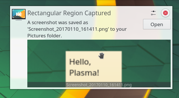
Unless something like https://kde.org/announcements/plasma/5/5.12.0/spectacle-noti... is what you consider to be passable looking of course.
Replies
maxloh • yesterday at 12:48 PM
For reference, Windows' notification look this way: https://www.lifewire.com/thmb/I4VO9qHrzphTHsZHU5eI73sLL9k=/7...
:max_bytes(150000):strip_icc():format(webp)/B1-Snipping-Tool-Windows11-46fbb894a6d04f289a0fdbf3f30c5c63.jpg)
The screenshot you posted is likely from KDE Plasma. The project don't have much funding to hire a UI/UX designer IMHO.
➕ show 1 reply
That looks perfectly functional to me? It only looks a bit ugly because the screenshot appears to have been of a very small part of the screen that got blurry when it was blown up to a larger size.
I'll take function over for every day. (I daily drive KDE, it works fine and doesn't get in my way. Most of the time I'm either in my editor or the terminal emulator anyway.)