 alt Hacker News
The colors look so different here:
https://nipponprints.com/images/tsuchiya-koitsu/summer-moon-...
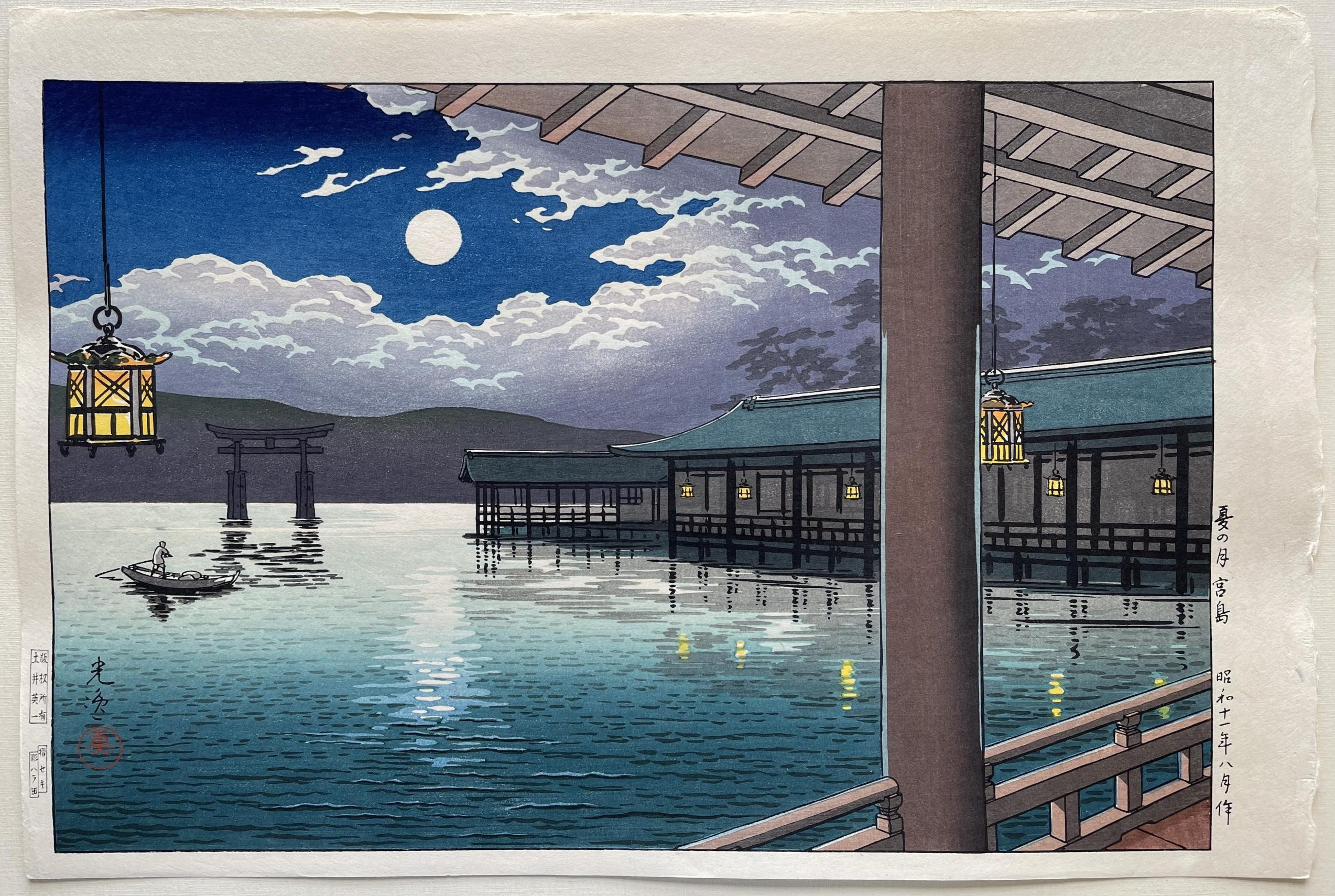
(non-deeplink: https://nipponprints.com/tsuchiya-koitsu/summer-moon-at-miya... )
Replies
runj__ • today at 5:57 AM
Different print impression (probably not by the same woodblock?), but both are beatiful!
➕ show 1 reply
That's the cool part about woodblock printing, you can use different palettes to make multiple editions of the same print. You have to reset the gradients on each pass, in either case.