 alt Hacker News
Here's another test of a cyberpunk ramen shop website.
One thing I've found LLMs have a lot of difficulty with is angular cuts / elements that aren't easily representable with CSS. Cyberpunk aesthetics are generally a great test of that, since they have a lot of microglyphs / window decoration.
Design source of truth: https://image.non.io/9d5fed20-b476-49d3-841b-37eb553fb88e.we...
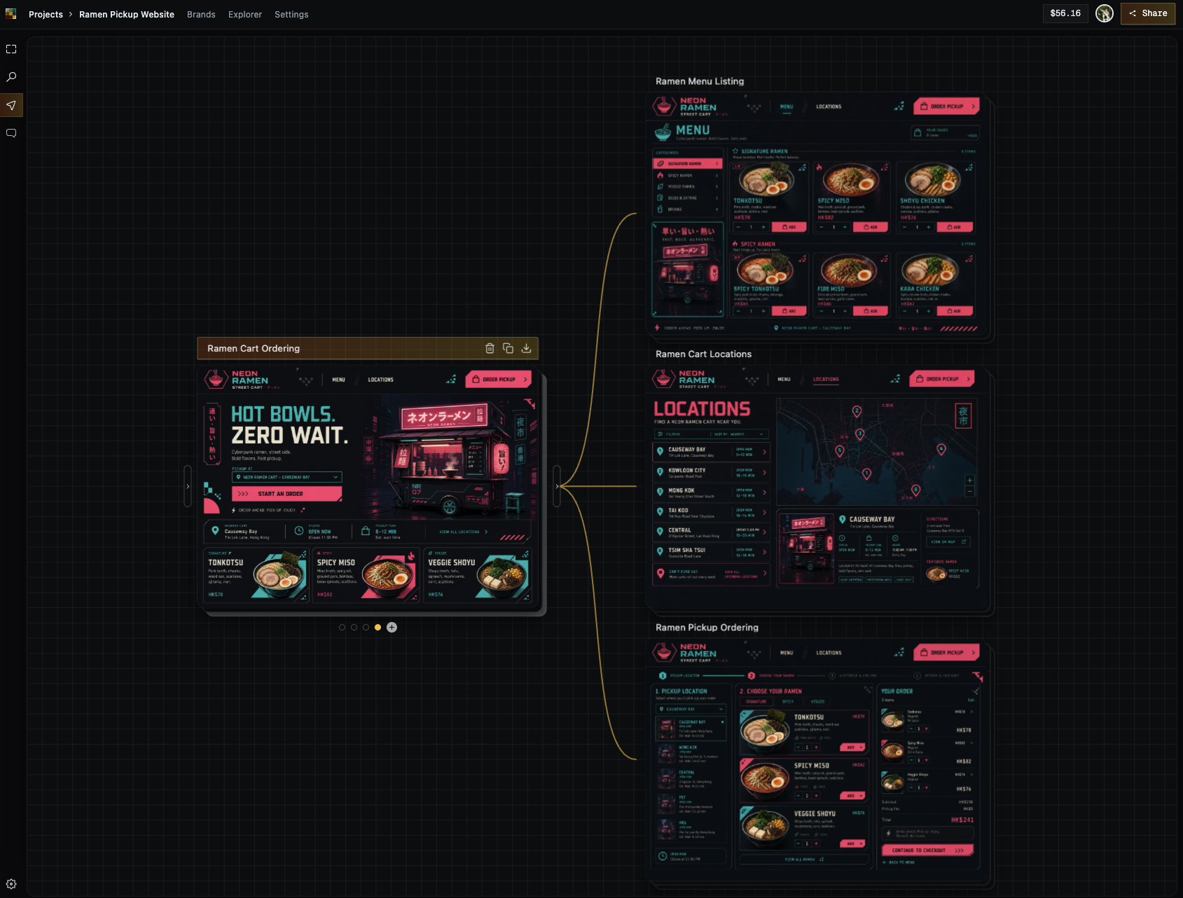
Opus 5 build: https://html.non.io/neonRamen/
Thoughts: It does a really, REALLY good job at these angular cuts / microglyphs. The responsiveness is off, but I'm very impressed at how well it did here. One way I think of it is "how close to a finished product did this get me?". Opus gets you like 90% there.
Replies
Just leaving this for anyone that says a design like this doesn't work: https://riceboxed.com/
I really like that design. May I ask the name of the website builder/diagram? Is it Relume?
The last 10% is gonna take 90% of the time though.
God damn, we are living in the future.
I love this so much.
Designs like this would never have seen the light of day in the cellphone incrementalism / corporate memphis era of tech. Now people can be weird and awesome again.
This is 1980's cyberpunk / late-90's Matrix / early-00's sci-fi UI. Great ideas that died to frutiger aero (which isn't a bad design aesthetic) and flat design (which is).
This is fun and it's got great colors and I love it.
It's so refreshing to see this.
AI rules. This is the best timeline.
Several other commenters have disparaging the design seemingly mostly due to its AI-generated nature, or maybe they actually do dislike cyberpunk.
Personally, I think being able to have these design languages be easily prototypable is fucking awesome. Great tests! (But a tad low-performance/janky, somehow). Though, I also like the cyberpunk aesthetic. Very on-brand(?) that AI generates it, hah.